Elle: inferring isolation anomalies from experimental observations
Elle: inferring isolation anomalies from experimental observations, Kingsbury & Alvaro, VLDB’20
Is there anything more terrifying, and at the same time more useful, to a database vendor than Kyle Kingsbury’s Jepsen? As the abstract to today’s paper choice wryly puts it, “experience shows that many databases do not provide the isolation guarantees they claim.” Jepsen captures execution histories, and then examines them for evidence of isolation anomalies. General linearizability and serializability checking are NP-complete problems due to extreme state-space explosion with increasing concurrency, and Jepsen’s main checker, Knossos, taps out on the order of hundreds of transactions.
Databases are in for an ‘Ell(e) of a hard time with the new checker in the Jepsen family though, Elle. From the README:
Like a clever lawyer, Elle looks for a sequence of events in a story which couldn’t possibly have happened in that order, and uses that inference to prove the story can’t be consistent.
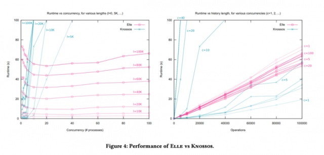
The paper describes how Elle works behind the scenes, and gives us a taste of Elle in action. Elle is able to check histories of hundreds of thousands of transactions in just tens of seconds. Which means whole new levels of stress for systems under test.
In the evaluation section we see Elle being used to test two SQL databases (TiDB, YugaByteDB), a document database (Fauna), and a graph database (Dgraph). By now I hardly consider it a plot-spoiler to tell you that it finds (unexpected) anomalies in all of them. You’ll find the details in §6 of the paper, and more information on the collaboration between Jepsen and the respective vendors to find and fix these issues on the Jepsen website.
What do we want from a transaction isolation checker?
An ideal transaction isolation checker would be able to…
- Work with general patterns of transactions (not just specially chosen ones)
- Detect many different types of anomalies, such that multiple isolation levels can be tested
- Provide minimal reproducible bug reports when it does find a violation
- Be efficient, so that large numbers of transactions at high levels of concurrency can be checked
- Only report genuine anomalies (soundness)
- Find all anomalies that exist in a history (completeness)
Elle ticks all the boxes, with the exception of completeness. In practice though, Elle typically does observe enough of a history to detect both cyclic and non-cyclic anomalies when they occur, with a guarantee holding under certain conditions.
Anomalies and the Direct Serialization Graph
Adya et al. gave portable definitions of isolation levels and anomalies in their 2000 paper “Generalized Isolation Level Definitions.” Central to the analysis is the notion of a Direct Serialization Graph (DSG). In a DSG nodes represent transactions, and edges between nodes are dependencies between transactions. There are three different types of edges possible between two transactions 

- a write dependency occurs when
overwrites a value previously written by
.
- a read dependency occurs when
reads a value previously written by
(ignoring the complications of predicate reads for now)
- an anti-dependency occurs when
overwrites a value previously read by
.
The thing all these have in common is that they imply
If only…
What Knossos does is identify write-read dependencies between transactions, translate these into an integer constraint problem, and feed it to a constraint solver to try and find a legitimate serial history. This works to a point but runs into the state-space explosion issues we touched on earlier with histories on the order of (small numbers of) hundreds of transactions. Moreover, when the constraint solver says “no”, we don’t have any insight into why the constraints couldn’t be solved.
This is all a lot more complex than the cycle checking needed in Adya’s model. For example, in a strongly connected component of a graph, every node in the component is reachable from every other node in the same component. If A is reachable from B, and B is reachable from A, we have a cycle! Tarjan’s strongly connected components algorithm can find the strongly connected components in a graph in linear time!
If only we actually had one of Adya’s Direct Serialization Graphs for a given run, then we’d have the triple benefit of anomaly detection exactly matching the definitions of the anomalies, explainability of the anomalies found in terms of those definitions (show the cycle), and linear runtime.
… there is one significant obstacle to working with an Adya history: we don’t have it. In fact, one may not even exist – the database system may not have any concept of a version order, or it might not expose that ordering information to clients.
Recoverability and traceability
So maybe we don’t have an Adya history out of the box. But can we recover one? That is, are there observations we could make of the running system, that are in our control, that would let us infer an Adya history? We know the nodes in the graph – that’s the set of transactions we submit – and we know the operations within those transactions (the reads and writes), as well as having visibility of commit and abort operations. What we need then, is some way of determining the edges.
If every written value is unique, and we have a scheme that enables mapping unique values back to transactions, then when we read a value (in
For a write dependency though, we need to know the transaction ![[(T_i, 1), (T_j, 2)]](https://s0.wp.com/latex.php?latex=%5B%28T_i%2C+1%29%2C+%28T_j%2C+2%29%5D&bg=ffffff&fg=666666&s=0&c=20201002)
If we’ve got recoverability and traceability then with a bit more work we can also find the anti-dependency edges – we have visibility into the return values of read operations, and we just have to look for traceable writes that append to that read value.
Because the model also includes commit and abort operations, this process additionally enables us to detect dirty updates where a transaction commits a version based on reading uncommitted state, as well as corruptions (garbage reads) where a transaction reads a value that no-one has written!
Inferring Direct Serialization Graphs
An inferred direct serialization graph is a DSG constructed from the inferred dependencies between transactions using the techniques just outlined. There’s one more piece of information we can use too, since we control the processes: if process 
Giving the database the benefit of the doubt
Things get a bit more complicated once we allow for the possibility of in-doubt transactions:
… when a client attempts to commit a transaction, but the result is unknown, e.g. due to a timeout or database crash, we leave the transaction with neither a commit nor abort operation.
Observations made in the presence of in-doubt transactions are said to be indeterminate. The problem then arises that there may be many possible histories compatible with the observation.
Elle provides soundness in the face of this complication by constructing a dependency graph which is a (maximal?) subgraph of every possible history compatible with that observation. If a cycle is detected in the subgraph, than it must exist in all compatible histories.
Putting it altogether
Putting this altogether, Elle can detect cycle-based dependencies (Adya’s G0, G1c, G-single, and G2 cycles), aborted reads, intermediate reads, and dirty updates.
In addition, there are phenomena which Adya et al.’s formalism does not admit, but which we believe (having observed them in real databases) warrant special verification.
These are the aforementioned garbage reads, as well as duplicate writes (the same argument written multiple times) and internal inconsistencies (where a transactions reads a value incompatible with its own prior reads and writes).
I’ve only been able to give a high level appreciation in this post, rest assured the paper itself is precise in its terminology and analysis, as befits the subject matter. If these ideas have caught your interest, it’s well worth reading in full.
The last word
Elle is effective. It has found anomalies in every database we’ve checked, ranging from internal inconsistency and aborted reads to anti-dependency cycles… Unlike solver-based checkers, Elle’s cycle-detection approach produces short witnesses of specific transactions and human-readable explanations of why each witness must be an instance of the claimed anomaly… We believe Elle will make the database industry safer.